2024 - 06 June
I’ve stopped using box plots (2021)
The article can be summarized in one image (which is the sign of a well-made image!)
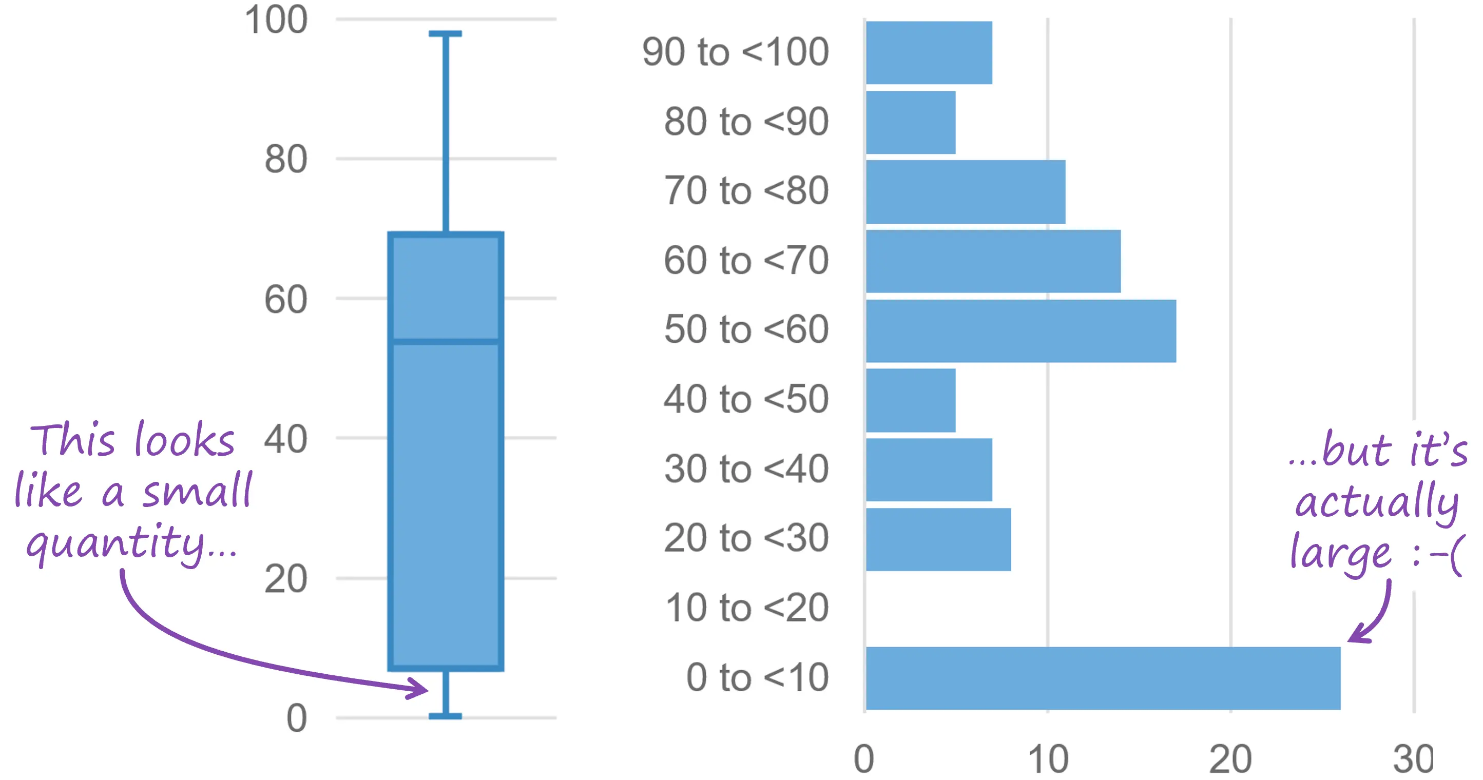
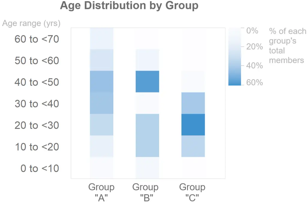
The alternatives to the box plot are all nice in different contexts. The one I like the most for large quantities of data is the frequency heat map:
The other two are the “strip plot” and “jittered strip plot”. These both break down with thousands, or possibly even hundreds out points to plot; in my opinion, those cases are such “small data cases” that there are multiple good options for understanding the data. Perhaps this article is more targeted to people creating figures for a diverse audience, rather than plotting data for yourself and other experts to understand.